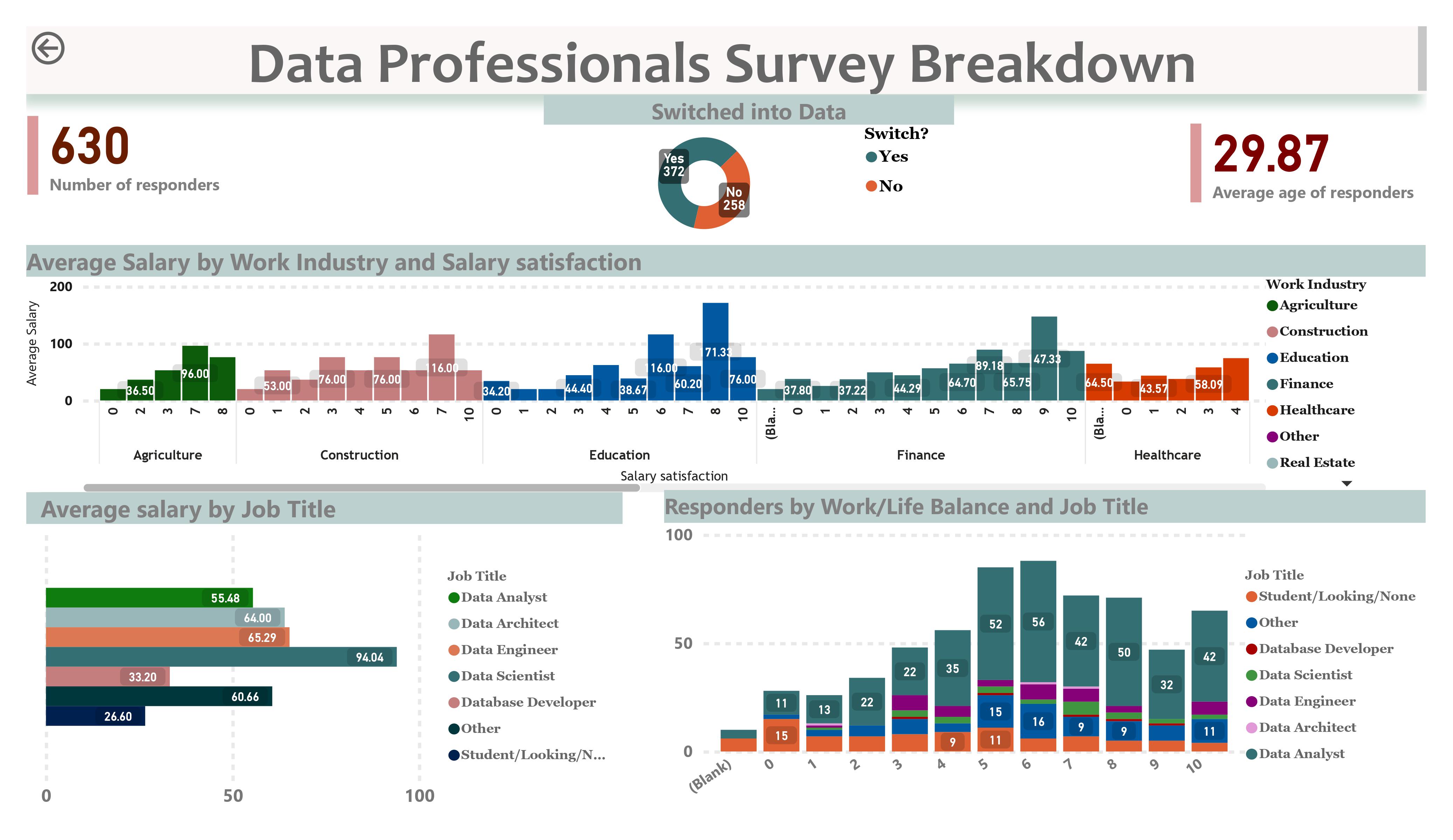
Data Professionals Survey Breakdown
A PowerBI dashboard created to analyse and visualise the findings of an online survey taken by 630 data professionals.
A PowerBI dashboard created to analyse and visualise the findings of an online survey taken by 630 data professionals.
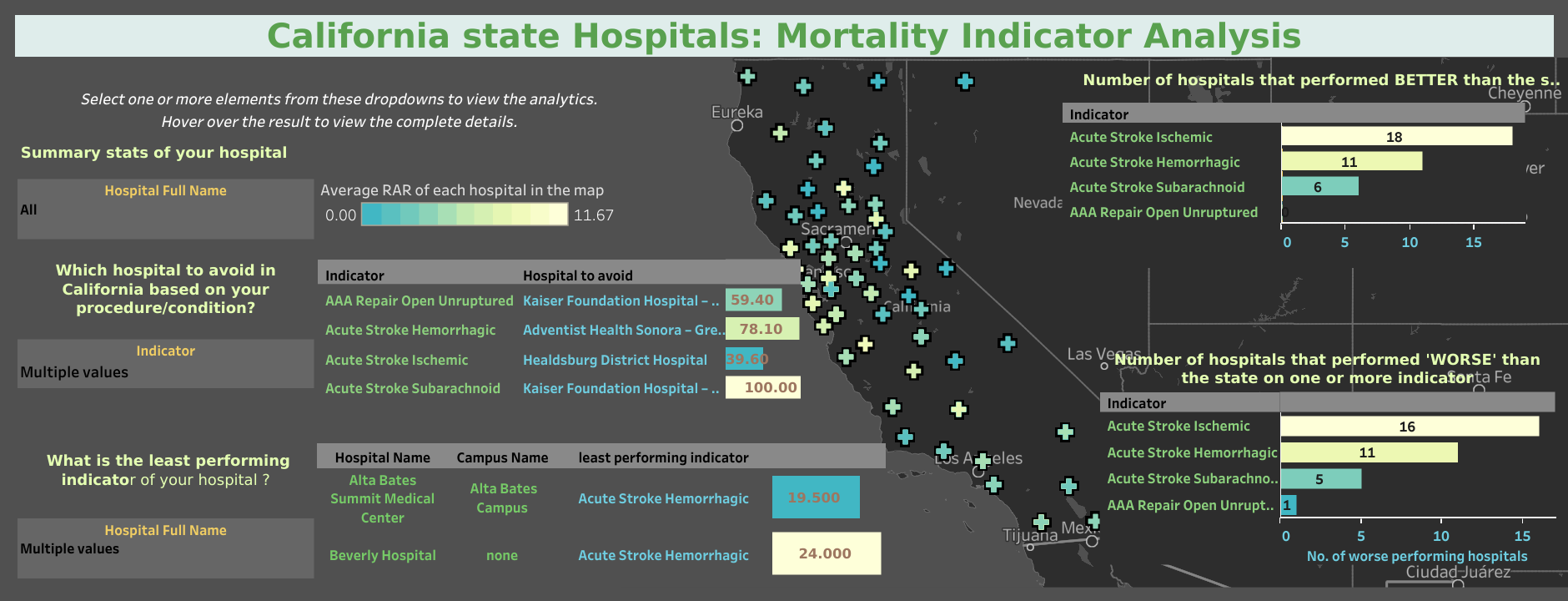
Data analysis and visualization of the Inpatient Mortality Indicators(IMIs) for California state hospitals.

Collaborated on two Omdena projects to solve real-world issues with innovative data sceince and AI based approach
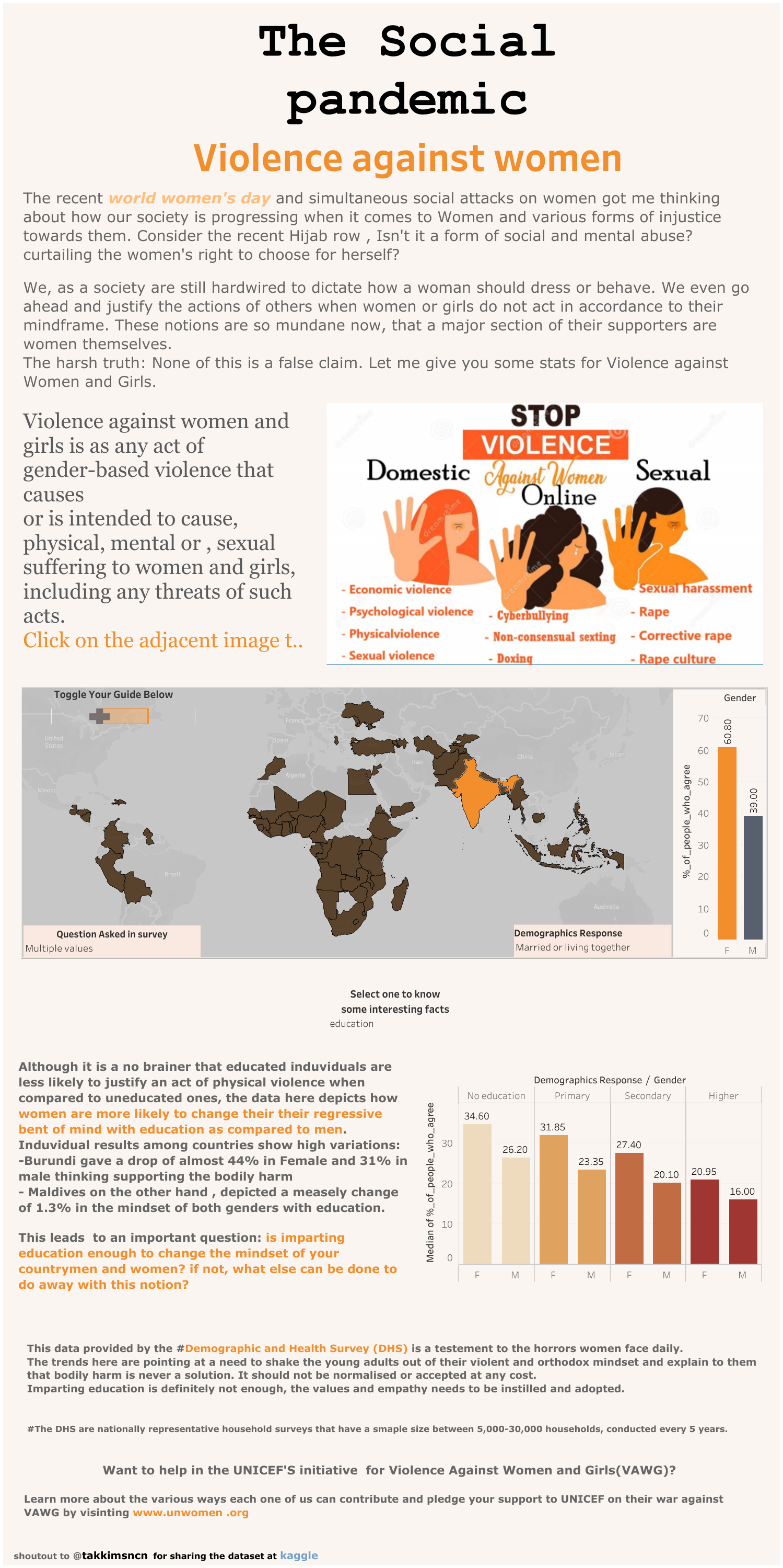
A toggle operated interactive dashboard on Tableau for a DHS survey across 70 countries.

A capstone case study on a fitness-band data using R, documented on a Kaggle notebook